Showing posts with label Art. Show all posts

Monday, 27 August 2012

Tunnel Visions and Minotaur Dreams


These first two are small oil studies,
exploratory paintings in a new series
called "Tunnel Visions",
hinting at the preciousness of sight,
again exploring boundaries between landscape,
aerial perspective techniques and abstraction.

As James Elkins has described so beautifully in "What Painting Is",
oil paint actively encourages this kind of thing -
a sense of depth and the wallowing in atmospheric effects!

Largely the marks are made with the thumb and fingertips
and occasionally rags.
Painting medium or solvent dissolves and blurs edges and allows for subtle skeins of pigment to criss cross one another and blend.

In the above example, alizarin crimson makes a dramatic note
which could possibly be seen as jarring, but that's the point
really - experimentation.

Below, sap green, white and raw umber are applied more
loosely, but with a similar end in view; that of suggesting a heavily
circumscribed glimpse upon some new realm.


Minotaur Dreams...


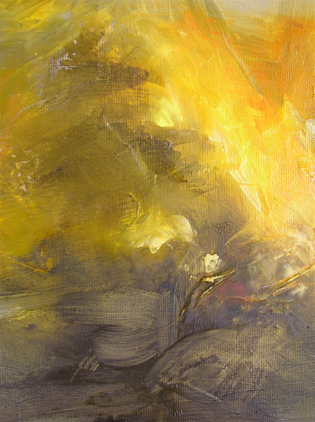
Above are two from the "Minotaur Dreams" series,
where similar techniques are used with warm raw burnt and red umber,
deep orange oxides, indian yellow  and smoky transparent blacks.
Solvent is sprayed on gently to make the paint more diffuse
and give detailed drip effects in some areas.
Rags are used to expose paler golden staining from the Indian yellow.
White and naples yellow are opaque additions that immediately create
a fog like area - sometimes this gives a sense of far distance
and a blurring of any hinted-at horizon.
Below, a Bull of the Woods, with an initial improvised drawing layer
using piped black acylic from a plastic bottle with nozzle
(the type you get in haircolouring kits).
This dries very fast and it's very satisfying to rub oil paint over
and around these contour lines.
That eye keeps  recurring. Slightly unnerving...


Thursday, 2 February 2012

You Did That!


Tonight the target figure for the crowd funding "Save the Old Lock-up Studio"
project was reached!
Sincere thanks to all who contributed!
I'll probably be asleep for the next few days... :-)

Wednesday, 18 January 2012

High summer revisited, mid-January

Summer Storm (II)
oil on gallery wrap canvas, 12 x 10 inches
Here I was revisiting an older painting idea, 
but aiming for a slightly different look, darker and more loose with less clearly defined shapes.


I


 I don't normally post such large closeups at full size but in this case I think it's necessary as my camera doesn't capture the effect of looking at the complete painting well at all!  I suppose that's only to be expected as it only has one lens for a start- like listening to an elaborate stereo track in mono!  
Violets and mauves are notoriously elusive, a camera really can never properly replicate the optical blending effects within our visual systems.  The experience of standing in front of a painting is so much more of a rich, multisensory experience. I hope one day to be able to have short video clips (in 3d?! hmm...) ranging over the painting, rather than static shots only. 


etsy link

Sunday, 11 December 2011

Catching up with Channel 4's Life Class: Today's Nude series.


A quick sketch done during the John Berger/Maria Muñoz episode.    I really need to go to a regular life class.  As you can see! 
But I found Maria - dancer and one half of Mal Pelo- so fascinating to observe  - her tough yet elfin androgynous grace. 
All episodes are intriguing though. I loved the encouraging guidance and sensitive comments by tutor Judy Purbeck in episode 2.  Once begun, I had to watch the lot in one session. They are only half an hour long each and as I was drawing along each time, they really sped by!  My only criticism would be that there was sometimes too much commentary in situ. I was quite happy for silence to reign, sometimes artists (Hume and Ocean specifically) seemed to feel an obligation to speak (very distracting for the artist and observer both, I think) rather than just leaving us to observe/draw.  Perhaps an occasional split screen might have been more useful at certain moments to reveal how the featured artists were progressing along.


Watch series one here (UK ONLY? Probably)
There's also a great flickr pool of others' drawings in direct response to the programmes here

As Maggi Hambling (the artist who accompanies us in episode one - a definite highlight!) and others emphasised: although the series makes a great introduction to life drawing, it's a completely different experience - a privilege actually - to really draw "from the life".
Why not have a go?  Is there a class near you?

Tuesday, 15 November 2011

New painting, "Ambergris"


11 x 14 oil on canvas board.


details:


view on etsy


Monday, 14 November 2011


Details from work in progress:


This first is a more "alchemy-influenced" painting,

-which feels as though it marks the coming of the dark half of the year,
a possible time for occultation, and finding strength deep inside oneself.
In the fog and murk one might at least stumble upon a new direction.
"Honour thine error as a hidden intention" as the Oblique Strategies card set
has it.

I'm currently exploring Taoist alchemy http://www.goldenelixir.com/jindan.html


Sunday, 13 November 2011

Meet Me at the Airport: The Midlands Open at the Tarpey

Well, near the airport, anyway... the Tarpey  gallery is situated behind a beautiful thatch-roofed house in Castle Donington high street.

Yesterday evening saw the opening night of the Midlands Open exhibition now in its third year.
http://tarpeygallery.com/index.php/art/midlands_open_2011/
One out of the three paintings I had submitted is on display,
Madeleine de Demandolx:


and I was very happy with its positioning and the lighting etc.
A great deal of hard work was clearly involved and to curate such a variety
and quantity of work well is not easy; the results were impressive.

I went along with fellow artist Rachael Pinks, (to whom huge thanks for making me aware
of the event and making it accessible to me as I don't drive.)
Two of her abstract paintings are on view there currently, in the main gallery room.
http://rachaelpinksart.wordpress.com/2011/11/09/midlands-open-at-the-tarpey-gallery/

I really like the gallery interior; the weathered red brick on several walls
contrasts well with the more conventional carte blanche setup.
I was surprised how well certain works look against these walls,
lending them a backdrop with mellow character.  (I was similarly intrigued
at how good several paintings looked against a background of living foliage,
at the recent Apple Day event!) I regret not taking a camera along, but wasn't
sure of the etiquette in these matters.  It was good to see the high standard
of work included, and the variety of media, techniques and subject matter.
The balance struck between  abstract and figurative seemed well thought out.
I was drawn as I often seem to be, to the printmaking side of things.
More ceramic works would have been welcome, but space was at a
premium, clearly and the limited amount of 3d work on show was great.

A few personal highlights: Two stone litho works by Serena Smith,
Pastorale I and II from the Exegesis series,  particularly caught my eye.
  Chris Pickup 's Turquoise Door.  
 John Paul Cooke's Untitled 890 (oil on board)
- as an aside, this was also very well framed,as Rachael pointed out to me.
It's a tribute to the framer that I had been aware only of the painting itself
up to that moment, yet when I switched focus to the framing,
it seemed perfect.)

Ashop for Joan, a small oil and varnish on canvas by Michael Bruzon on
display in the lobby of the main house, appealed to us both.

I also enjoyed the sculptures in resin and wire by Jason Carey, and
  Sarah Fiander 's winning sculpture Pale Vessel (which I immediately
wanted to curl up and sail away in) and related painting.
The joint prizewinner was Inge Tong, for her Anon series.

It was exciting to see all the work together, jostling for attention inevitably,
but conjuring up a strong sense of a lively contemporary art community
in the region. This was a busy two-hour event and this inevitably meant
it wasn't possible to take everything in, or indeed connect with any artists
(I'm rubbish at schmoozing and we kept having to flee outside to cool down
and top up on oxygen!) - altho I did meet Andy Parkinson very briefly!
But I hope to discover more in the coming weeks and share my finds here.


Two other paintings, Caw and Clatter


and Machiavellian 

are also currently held by the gallery.  All three works are available for purchase.

The exhibition continues until Christmas Eve.


WEDS - SAT : 11AM - 6PM 
TARPEY GALLERY 
77 HIGH STREET 
CASTLE DONINGTON 
DE74 2PQ

http://tarpeygallery.com/index.php/art/contact/


Tuesday, 18 October 2011

New painting, "Caw and Clatter"


This is part of a series using gestural large brushstrokes in blackboard paint, with oil colour overlaid with painting knives.  It's partly inspired by the sounds made by corvidae and other birds in and around the trees in autumn.   
The painting is available via the Tarpey Gallery.

Monday, 19 September 2011

Work in progress, mid -September


New impasto abstract, "Red Queen In Autumn"


Oil on Canson Figueras sized painting paper, 40 x 36 cm.  


... and a couple of details:


These details will lead to further paintings I think, this time..   I need to explore working with broader strokes using larger brushes or ideally larger painting knives.

Loving my new Mameiri Classico Cadmium Red Light.

The title also refers to an Italian "giallo" film, "La Dama Rossa Uccide Sette Volte", English title "The Red Queen Kills Seven Times".  It has a brilliant  Bruno Nicolai soundtrack which I've been listening to a lot lately.  I find a lot of his work autumnal, in an exciting blustery way.  Here's a highlight, 


Red Queen In Autumn  etsy link


Saturday, 17 September 2011


Leafing through a book on Australian art this afternoon I chanced upon a small image of Ian Fairweather's Monsoon.  
Wonderful work! I wish I could find more about this artist on the web. 
Please let me know if you have other links to images/ info. Thanks!


http://www.couriermail.com.au/entertainment/arts/bribie-island-hermit-ian-fairweather-shunned-fame/story-e6freqkf-1225848379708
http://www.evabreuerartdealer.com.au/artists/ian-fairweather/ian-fairweather-1891-1974


James Kalm on the Willem de Kooning Retrospective at MoMA

I was really excited to watch part 1 of James Kalm's video of the de Kooning retropective at MoMA:
http://www.youtube.com/watch?v=S23gXv8FUfA


So much amazing never-seen-before (by me that is :-D) work!
I think I am going to have to watch it hourly for a week or two to
really take it all in!  Thanks so much, James.

edited to add: parts 2 and 3 now up.
http://www.lorenmunk.com/videos/index.html


detail from "Secretary"


detail from one of the 
oil on composition board pieces


detail from "Black Friday"


I was particularly taken by the white-on-black oil (and/ or enamel?)
on composition board paintings, sometimes having
flashes of colour.

Saturday, 13 August 2011

Recent small works, A Distant Harbour/ Mask in Roses


Something Lies...(just out of view)


It's quite a strange process trying to recreate a small painting whose atmosphere I really like, on a larger scale.
At this point it looks very crude to me, a bad attempt at a copy.
The original developed intuitively whereas this is more a fake, a rehash.
It seems to completely lack the depth of the original too at the moment.
Yet I want it to work, it feels like a worthwhile attempt, as I would be interested to see if
I can make it work on this larger scale, and it's quite a challenge technically.
There are some interesting things going on inside, though, if you look closer...


two details:


I've begun to add glazing layers.  After working for some time something kicked in and the painting suddenly seemed to come alive.  I was finding gorgeous translucent mixes of deep transparent colours, blended on a palette without being too muddied together, so that they really glowed forming chords.


Two images of the original painting; photo with edges cropped and, below, the composite from scans (edited).
The original has a depth and a soft gentle quality that I desperately want to recreate.
It flows together,  undulates and is unified.

There's a strong Leonora Carrington influence at play here... she died quite recently; perhaps this is part of the reason why I want to make a larger version.

Also memories of a visit it the Sitwell's family seat Renishaw Hall, where  John Piper painted resonant works during the 1940s.

I used to have an album on vinyl of Edith Sitwell/William Walton's Facade,
from which my painting's title is borrowed.

The key musical influence here though, is Adams' "Shaker Loops", the slow passages of which were used extensively in the wonderful BBC Omnibus film on Carrington, Leonora Carrington and the House of Fear, which made a great impression on my imagination.  Its effect was so strong, and it has inspired me again and again throughout the years.  Seeing and subsequently recalling this glimpse into Leonora's work and surroundings, learning of her formative experiences really helped me to develop confidence in myself as an artist and to believe that I too would find my way creatively.  Paintings such as Crookhey Hall, The House Opposite, Ferret Race, Samain,  Night, Nursery, Everything and others continue to inspire me.  I recommend her writing, too, it's very sharp, subversive and funny as well as magical.


I love all the fine texture in the image below, largely from darker paint (raw umber etc) on a dry-ish brush
and wipeaway strokes with rags forming multiple fine lines over lighter areas,
giving it a somewhat print-like appearance.  The colour has been subdued somewhat
and the sharpness and contrast increased.